UX Case Study - Redesign Project
Threat to Opportunity
"Shall we order some food today?"
One day my friend, James, said to me. As always, I grabbed my phone and opened the app, "Eat.ch". However, unexpectedly and unusually but interestingly, James was using another app called "Uber Eats" for the first time. We both have been using the Eat.ch app for most of the time before. Since I started to use Eat.ch, I even felt like I have no other choice when ordering delivery food. Well, then I asked myself. 'What happened to James for the last few days?'.
'What brought him to this change getting interested in another app?'
ABOUT THE PROJECT
BACKGROUND
Since the advent of COVID-19, our lifestyles have changed. Meetings with family members and acquaintances at restaurants are usually held in a space at home. As a result, the number of users who use food delivery apps has increased rapidly in recent years, and the demand for delivery services has increased rapidly.
The increase in the number of delivery app users is good news for “Eat.ch”, but it also means that there will be many competitors in this market. With the current emergence of “Uber Eats”, users of Eat.ch have moved to Uber Eats.
GOAL
In this project, we analyse the reasons for users’ move from Eat.ch to Uber Eats. We aim to provide users with a better user-centred interface by applying rationale Design solutions that are based on in-depth User Research, Testing and Iteration processes.
ROLE
-
User Research
-
User Testing
-
UI & UX Design
-
Visual Design
TIMELINE
6 weeks
TEAM
Research & Design - Joyce Heo
Project Manager - Adam Schweizer
I understand that "focusing on the user may bring all else". However, as a designer, I needed to consider business perspectives as well in order to bring the business's vision and goals to the users' lives and define the business's products and services they create accurately. Here are the main challenges and solutions that we have found:
Challenges
User aspect - There is a food delivery app that has been used by local users all the time, however, an app that made it more convenient appeared. The users are hesitating to move to a new app that makes it easier to experience their orders.
Business aspect - The demand for delivery orders have increased recently. The supply will increase as well. Competitors are emerging. There is a risk of losing customers if they don’t develop their competitiveness in order to survive.
Solutions
User Interface - We will embody a more user-friendly interface that makes users lose the reasons to look for other apps. The interface will be redesigned based on user interviews and user experience analysis.
Business Competitiveness - Market research reveals what competitiveness is to increase the loyalty of current customers and captivate the hearts of potential customers. We will establish the optimised interface based on customer needs.
Process of the project
1. User experience analysis will identify problems with the present Eat.ch interface.
2. We will find opportunities through User Research and redesign more user-friendly interfaces with the findings.
3. User feedback will provide a more optimised interface for the user experience that may eventually strengthen the business competitiveness.
COMPETITIVE ANALYSIS
+ UX RESEARCH
EXPLORE
01
DISCOVER
COMPETITIVE ANALYSIS
Scale & Quality
Cost of the services


- UberEats was founded in Santa Monica, California, and has been in business for more than nine years. As of 2023, it is an online food order delivery platform that is quite large enough to record more than 10 million downloads on Google Play. It offers almost all menus, including breakfast, lunch, brunch, and dinner, and some offer 24-hour services. The delivery fee is $4.99 as of 2017, excluding tips. Customers can track delivery status after ordering.
- EAT.ch is a startup created by university students from Switzerland, and the service began to be developed in 2007 and has grown significantly since it signed a partnership with Just Eat in the UK in 2015. As of 2016, the number of users reached 30,000. In Switzerland, which has a smaller population than in the UK, 30,000 is not a small number. Users can search in the order of low delivery costs by matching nearby restaurants by entering only the ZIP code. The difference from UberEats is that EAT.ch's delivery costs vary depending on the delivery distance and the menu of the food. For a 16-year-old service, the quality seems to be inferior to UberEats.
As a UX Research & UI design team, we focused on investigating and analyzing 'how EAT.ch can better serve its users and improve service quality and value' compared to its competitor UberEats.
UX RESEARCH

How we conducted our User Persona
Firstly, we conducted a survey with 10 participants from the first-time users to the sophisticated users. Then, we identified significant behaviour patterns and synthesised characteristics. After defining goals and designated Persona types, we interviewed two participants from the survey who are mostly close to the Persona Types. At this research, we focused on exploring Users' Motivation, Satisfaction, Interest, Flow, and Design Preference.

▴ Survey questions and answers.
Findings
We identified significant behaviour patterns in each subject.
Motivation
-
31.3% of the respondents use the app “to order some specific food that they love”.
Satisfaction
-
61.5% of the respondents are NOT satisfied with the “lack of images of the food that they want to look at in detail”.
Interest
-
40% of the respondents have SEEN “Uber Eats app or other food delivery apps”.
User Flow
-
46.7% of the respondents run the app “when feeling hungry”.
-
40% of the respondents run the app “when feeling can’t be bothered to cook”.
-
50% of the respondents “Search a specific menu they wanted to try - Order - Receive Delivery - Exit”.
Design Preference
-
40.9% of users prefer a clean/simple design.
-
36.4% of users prefer an easy-to-use design.
-
90% of users preferred the food image-based screen rather than the text/restaurants’ logo image-based screen.
-
70% of users preferred the iconic and adjustment bar filtering function rather than the text-based filtering function.

▴ Survey results in charts.
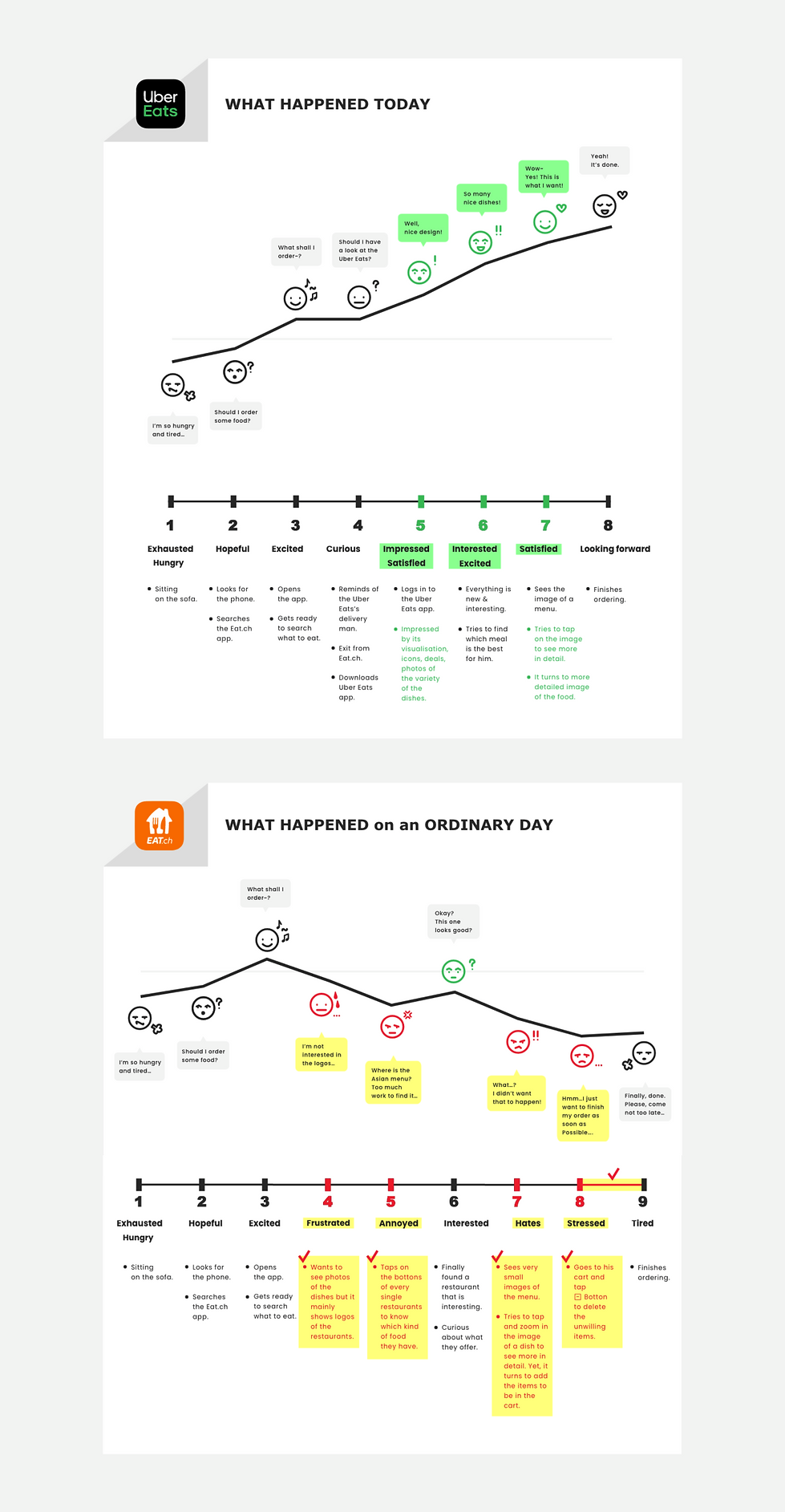
WHAT HAPPENED to John on ORDINARY DAYS...
John is a single man living on his own. He works as a chemist at a pharmaceutical company. Every time when he gets home, he feels very tired after work and very hungry. He doesn’t have the energy to cook dinner right away after work. Eventually, as usual, he decides to order food through the Eat.ch app.

WHAT HAPPENED to John TODAY...!
John still works as a chemist at a pharmaceutical company. This evening after work, he comes home with severe tiredness. He is very hungry today as always, so he has no energy to cook right away. As usual, he opens the Eat.ch delivery app for ordering his dinner. John usually orders durum from a Turkish restaurant, however, today he wants to try a new dish from a new place. Since he saw Uber Eats delivery men on his way home several times, he thinks. ‘Is Uber Eats good?’. He starts to search the Uber Eats app.

CONCEPT
MAPPING
EXPLORE
02
We used the Customer Journey Map method, which allows us to closely observe the user flow with regard to emotions, behaviours, words and thoughts to find the Pain Points. The reason why we chose to display the User Journey Map rather than showing the simple listing Idea Mapping tool is to empathise more deeply with the user’s emotions. The effectiveness of User Journey Map application was surprisingly helpful. The response of John expressed step by step at every single moment to the interfaces and the functions of the apps explained the causes of the Pain Points naturally and clearly.

▴ User Journey Sketch
I have decided to reorder the two different journey maps. I put "WHAT HAPPENED TODAY" in the first place and "WHAT HAPPENED on ORDINARY DAY" in the second. I found that it is easier to find pain points and a benchmark by comparison and look primarily into the dominant position in this order.
USER FLOW
EXPLORE
03
USER JOURNEY MAP

HUNTING
PAIN POINTS
EXPLORE
04
PAIN POINTS to OPPORTUNITIES
We set up a strategy to compare the experiences of two different interfaces. The reason for this is that we believe opportunities can be found in greater depth by benchmarking the results of different responses to different information and services. It closely covered John’s experience in the interfaces of Uber Eats and Eat.ch apps. Later, recorded videos were observed and analysed as well as an interview. As a result, several opportunities have been found by the integrated three main Pain Points which will develop the Eat.ch interface more competitive.
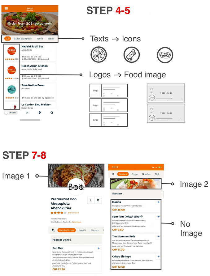
3 PAIN POINTS
1
He has to tap and check every single buttons of the restautants in order to see what kind of food they have.
2
The images are very small
+ NOT possible to zoom in the image
= No way to imagine how the meal would look like in real.
3
He taps on the image but it turns to add the item in the basket. Then he has to delete all the items added unwillingly.
OPPORTUNITIES
1
There is a curiosity in images of food for the users, rather than the logos of the restaurants.
2
The users want to access the easiest way to find a menu.
3
The users desire to look in detail of the image of a meal.
IDEATION
How might we...?
EXPLORE
05
HOW MIGHT WE : redesign the food ordering experience
FOR : the Users of Eat.ch
SO THAT : it is more accessible and informative with images.

WIREFRAMING
& POLISHING
IMPROVE
06
WIREFRAMING & POLISHING

LEARNINGS
LEARNINGS
It was a good approach that I tried to obtain a deep understanding of two different perspectives, Users and the Business. We figured out how different their perspectives and goals are. I realised that designers may easily be biased at any time in user research processes. Why? The reason can be an excessive desire in creating an ideal design with one's own taste, development of new things with one's own values, thoughts, etc.
We found that a focus on minimising steps of users' journey is crucial to help the users save their time and effort to achieve their goals. In addition, it may also be a benefit to the business to reduce time to solve problems, for example, see negative feedback in Steps 8 to 9 of WHAT HAPPEN on ORDINARY DAYS (Eat.ch).
WHAT COULD BE IMPROVED IF...
This project had limited data and was a lack in range of feedback. If some budget was provided, it is likely that a survey of 100 people could be created to obtain more qualified data. Through a lot of feedback, we could also be able to design a variety of functions and features that fulfil Users' needs.