
NOMARI PROJECT
Let's discover & build Web3!
Web 3.0 has been a hot topic since 2021. Web 3.0, which represents "decentralization," will continue to develop into the latest technology and personalized next-generation Internet environment with the attention of Silicon Valley and other IT industries around the world.
Today, Metaverse and NFT have also begun to gain popularity as technologies suitable for web 3.0 environments. Of course, there are some skeptical views on Web 3.0, but many IT industries seem to acknowledge that Web 3.0 is the next-generation Internet.
The advent of Web3 and NFTs. What interface will NFT users experience?
ABOUT THE PROJECT
BACKGROUND
As the media actively reported about Metaverse in 2021, my client was highly interested in the NFT business. Their understanding of the fast-changing NFT market was also high. The client requested rapid market research on the metaverse and NFT markets and wanted to launch an art-oriented NFT project.
GOAL
Accordingly, this project aims to examine the experiences, tendencies, and needs of NFT users in the upcoming era of Web 3.0 and see how the most accessible and most exciting experience for users can be represented between existing Web 2.0 and developing Web 3.0 technologies.
ROLE
• Art & Design Team Lead
• Project Management
• NFT Design Management
• NFT Web Design
• Collaboration and communication with the external developer group from the client's company
TIMELINE
6 months
TEAM
Design Lead - Joyce Heo
Project Manager - Adam Schweizer
Art Director - Jihye Heo
Illustrator - Jihwa Hong
00
DISCOVER
FIELD STUDY
How might we...?
How might we design the most attractive and valuable NFTs and its website rapidly for the current potencial NFT users in the Web 3.0?
MARKET RESEARCH
EXPLORE
01
COMPETITIVE ANALYSIS
High Quality Visual & Storytellling
Poor Roadmap
Solid Roadmap
Low Quality Visual & Storytellling
The evaluation criteria in general used in the comprehensive analysis are the level of quality and cost-effectiveness. However, what I realized through market research on the Web 3.0 environment was that NFT users tend to differ significantly from the analysis criteria for existing Web 2.0-based services.
NFT Purchase Criteria have been based on the following below:
- how attractive and meaningful the visual or NFT's story is
- how solid is the project's roadmap or team structure is
- how energetic the NFT community has
- whether it is a reliable project, etc.
As a design team, we focused on strengthening visuals and storytelling compared to competitors. Roadmap composition and community management were handled by the business operations and marketing team. Of course, visualizing the roadmap is an extension of the design team's storytelling area, so the design work continued through sufficient communication with the business operation team.
USER EXPERIENCE
RESEARCH
EXPLORE
02
OPEN CARD SORT
ABOUT
HOME
MENU
CONTACT
TEAM
SETTING
PROFILE
LOGIN
SIGNIN
SUBSCRIBE
FAQ
SHOP
IMAGE/
VIDEO
MUSIC
3D
2D
WEBTOON
ANIMATION
HEADER
FOOTER
PARTNERS
FEEDBACK
REPORT
DISCORD
OPENSEA
Like button
ROADMAP
Card sorting is a method of asking users to label information according to their logical systems. Users receive a series of cards and are asked to organize and classify them as they think are appropriate.
In open-card sorting, users are free to assign desired names to groups created with cards in the stack. In contrast, closed-card sorting is a variant in which users are given a predetermined set of category names, and users are asked to organize individual cards into predetermined categories. We decided to use the open card sorting method. This was because our design team guessed there might be findings of unexpected user needs through the user's ideas.
We provided 30 cards that our design team named and asked the users to add any items if necessary. We shuffled the cards and asked the users to sort them into piles and label them as they wished to get provided and needed for their future user experience.
USER 1 - Most active
IMAGE/
VIDEO
NFT
SNEAKPeeK
ABOUT
PROFILE
OPENSEA
CONTACT
FEEDBACK
ROADMAP
2D/3D
TEAM
DISCORD
MUSIC
PARTNERS
Home
Menu
SNS / Link
Contact
FAQ
shop
USER 2 - Passive
ANIMATION
ABOUT
SERVICES
CONTACT
FAQ
opensea
shop
TEAM
ROADMAP
LOCATION
Discord
MUSIC
Home
MENU
CONTACT
SNS
IMAGE/
VIDEO
USER 3 - Just interested
ANIMATION
ABOUT
TEAM
SERVICES
ROADMAP
CONTACT
FEEDBACK
NFT ART
OPENSEA
LOCATION
SERVICES
FAQ
PARTNERS
Home
ABOUT
SERVICES
CONTACT
IMAGE/
VIDEO
VISION
First, we colored the most repeatedly selected cards as a priority while looking at the card sorting results. The blue cards are necessary items for all three user types. The green cards are necessary features selected by two user types. In addition, the yellow cards are exceptions that our design team did not provide and the card items that had been filled out by the user who thought it was necessary.
IMAGE/
VIDEO
ABOUT
TEAM
ROADMAP
OPENSEA
CONTACT
FAQ
MUSIC
PARTNERS
shop
DISCORD
FEEDBACK
ANIMATION
NFT
SNEAKPeeK
SERVICES
LOCATION
NFT ART
VISION
Results - Sorted by Priority
USER JOURNEY
MAPPING
EXPLORE
03
USER JOURNEY MAP
PHARSES
1
2
3
4
5
ACTIONS
EMOTIONS/TOUCHPOINTS
OPPORTUNITIES
Visit the website.
First impression at HOME page; image/video
Move to ABOUT section. See the story of the project.
See NFT concept and sneakpeeks.
Check on the Roadmap.
Read FAQs.
By applying animation effects to the background where you can feel the overall story of the Nomari project, it strongly instills the first impression of users.
It provides an explanation of the project's story directly on the main page, raising the fun and expectations of the project without delay.
It displays high-quality NFT art to increase project expectations and future NFT purchasing needs.
It increases professionalism and reliability by organizing a more systematic and structural roadmap than competitors by section and organizing the vision, direction, and plan of the project.
It consists of non-ambiguous, concise, and easy questions and answers to avoid confusion that users will feel.
HUNTING
PAIN POINTS
EXPLORE
04
PAIN POINTS
1
By checking the images of the NFT projects, it makes us feel their visual concept, but the story of the project is not clearly shown from the images. We need a strong visual that shows the story, not the stagnant image. Storytelling visuals stimulates curiosity.
2
Competitor 1, 2 do not have an ABOUT page. For this reason, users should look at the overall content without knowing the focus of the project. At the end, they are questioning, 'So what's the project about?’
3
Competitor 1 offers only four sneakpeeks, while Competitor 2 provides a gallery equipped with various filter functions. However, the disadvantage of the gallery is that there is too much visual information, and it can be annoying because users have to click on the filter. Competitor 3 places Sneakpeeks in Doodles > About in the navigation menu, so you must pass through two steps of the flows to see the sneakpeeks.
4
Without a roadmap section (like Competitor 2, 3), it is difficult to understand what the projects are trying to do. Users may not know their plans until they take time to look through all the contents of the project, or they may still not know it at the end.
5
NFT projects usually provide FAQs before NFT launch. In other cases, the FAQs are usually provided through Discord, and inquiries are made. However, early users do not know about Discord, need a subscription procedure, and it is not easy to adapt to the use of Discord channels after signing up.
IDEATION
CONCEPT SKETCH
EXPLORE
05
.jpg)
- ANIMATED IMAGE
: We set visualising the overall story in the banner of the main home screen (which is the space of opportunity to firmly instil the first impression) as the most important task.
- ABOUT
: And it was decided to induce an easy understanding of the ABOUT section by providing introduction content immediately.
- NFT SNEAKPEEKs
: NFT sneakpeek display is planned to focus on high-quality NFTs as the second most important visualizing element after the banner on the HOME screen.
- ROADMAP
: The roadmap will be classified as a navigation menu and a roadmap page will be created separately so users can find it easily.
- FAQ
: In the case of FAQ, it was inserted into the HOME page so the user could immediately solve their curiosity after the first visit.
WIREFRAMING
EXPLORE
06
WIREFRAMES
.png)
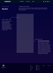
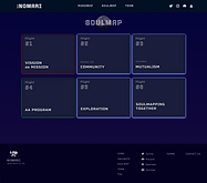
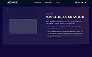
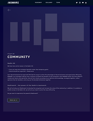
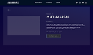
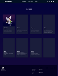
TESTING
LISTEN
07
AFTER TESTING
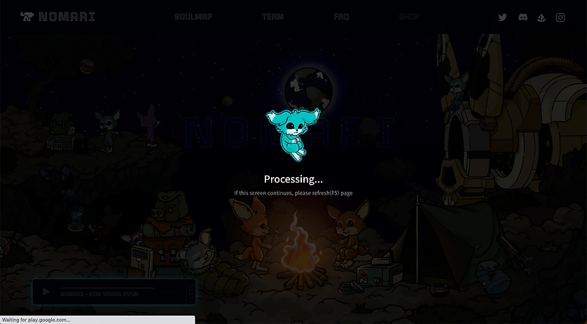
- Pre-alert for Loading Time
: We completed wireframing simply and started development immediately to keep up with the rapid changes in the NFT market. We discussed the overall flow of wireframes with a group of developers and found one crucial need for the users. The load time was needed because many images and animation effects were placed on the HOME page. So, with the message that it is loading, the NFT character appears so that the users can enjoy it while waiting the loading time.

- Insert Music Bar
: Users and design team members pointed out that if there could be background music, it could add the sensibility of the story as the background visuality and characters that showed the overall story of the NFT project was featured along with animation effects. We decided to produce music and add a music bar to the main screen. Of course, when it comes to background music, it automatically flows out as soon as the website is accessed so the play button must be pressed to avoid a situation in which the user is embarrassed in the office or public place. In addition, user-centred functions were added so that the music bar could be re-sized and moved so that it did not interfere with the field of view when scrolling.
_edited.jpg)
- Delete the Roadmap page & Team page and move them to the HOME screen
: There were cases where roadmaps were the most important among NFT users. This is because the roadmap of the project can serve as a criterion for determining the future direction, that is, whether it is worth investing in NFT. Also, the composition of the team has become a very important factor. The more professional the team members have in each field, the more attractive and reliable the project is. Therefore, we decided to show the concept, description, roadmap, and information about the team all in one place on the HOME screen.
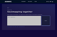
- When clicking the Soulmap > buttons, omit the navigation bar
When discussing a service page called SOULMAP with the developer team, it was suggested that the contents of each button of SOULMAP should not be moved to another page because it is a context from SOULMAP. Our design team agreed on this point. When the button is clicked on, it will not go through the page movement but will be processed as a pop-up.

- Adjust the size of the button
: In the introduction page for a service, SOULMAP, the size of the button was different according to the importance and the proportion of the service. Therefore, users can intuitively feel the weight of the service.

- Add SHOP page
: In terms of marketing, it was suggested that if the SHOP page is added and promoted as in the process of building(even though the SHOP page has not been fully prepared), it can increase the willingness to purchase NFTs and maintain expectations for the future of the project. So we decided to add a SHOP page on the navigation menu.


.png)


